Monday 12 December 2011

DESIGN PROCESS. 'How to...' Self- evaluation

Review the work produced in response to the 'How to...' brief identifying the following:

  • What problem did you identify?
  • What evidence did you find to support your decisions?
  • What methods did you use to gather your evidence and what forms did it take?
  • (categorise your research using terms primary, secondary, quantitative and qualitative)
  • What methods of research did you find useful and why?
  • How did these inform your response to your problem?
  • What methods did you encounter as problematic?
  • How did you overcome this?
  • What research could you have carried put that would have proved more useful?
Answers: 
  • How to prepare a christmas dinner without stress
  • We did some surveys,looked at books, found a lot of tips online, also some recipes and asked people (our families)  about how they prepare their dinner.
  • We did design sheets, blogged everything, took some pictures, did some folding, wrote down some tips or ideas in notebooks. 

  • I think secondary qualitative research was really useful considering our problem. We couldn't do that much primary and quantitive  research weren't that easy to do - we are talking about cooking.
  • Basically we started off  doing a lot of research about 'How to prepare a meal without wasting time and money'  and throughout the whole process of research we realized that this topic is to broad and only based on research and studio crit we decided to narrow it down and  ended up doing more focused final idea and design. We didn't know where we're going to end up and that's why as Bruce Mao said we ended up with something we all were glad. Only because of the research we were able to make a decision that time is the one problem everyone has during the holidays. 
  • Primary research was a bit more harder for us I think, it's better do bas the final piece with wider numbers or more calculated statistics, than just asking people around. Though I think all the methods are good - it only depends on the topic that are given which research methods are going to be more or less useful.
  • We balanced the quantitative with qualitative, primary with secondary. 
  • I think doing surveys are more useful if you have a more focused audience, lets say: students or course mates. Than again statistics that are gathered throughout a country or a city might be more helpful for a less focused audience. 

Five things that I learned about the process:

1. I realized that research is a never ending circle. It's not all about making one decision and going for it. In any point you might need to revisit the research or do more research that will help you to develop your final piece.
2. Research is as important as the final work.
3. Primary and secondary research may also be categorized in quantitative and qualitative.
4. The best way to start thinking about the problem is to ask yourself: HOW? WHY? WHAT IF?
5. Also I learned the strategy for thinking through a problem:  
1. assimilation
2. general development 
3. development
4. communication

List five things you would do different next time:

1. Start doing the final piece a bit earlier
2. Organize the research a bit better and clearer 
3. Don't get stuck in the 'research' zone for too long. 
4. Organize my time better. 
5. Decided on tasks for each group member so we wouldn't get the same research stuff and doing the same things. That there wouldn't be repetition in the research.

Monday 21 November 2011

DESIGN SKILLS. SELF-EVALUATION.

1. What skills have You developed  through this module and how effectively do you think you have applied them?

ans: I have developed illustrator skills. I have never worked with illustrator before and already  feel quite confident though I know I have much to learn in the future. I also never worked on design sheets and I think it's a new skill as well. I now know how to prepare files for printing and where is the digital printing dungeon. As well I learned about different colour modes and how they can effect the final piece and how to use envelope layouts for designing and how you view them  on screen in order to print them out  logically. (when folded are in a logical viewing order)

2. What approaches to/methods of idea generation have you developed and how they informed your design development process?

ans: Well, I learned that well stated problem is half -solved. And the best way to start your idea generation is brain storming. Than researching in order to dig deep and I guess trying out ideas. We did a lot of workshops in order to start our idea generation and I think they helped a lot: linking words to simple phrases or the other way around, drawing images that describe an adjective, doing a short list research about something, searching for meanings and definitions, questioners...

3. What strengths can you identify in your work and how will you address that in the future?

ans: I think I'm quite neat  and I have the patience to spend hours going into details. In the future I'm hoping to be the same, though I hope I'll improve the timing of doing stuff. Because now some things take ages to produce.

4. What weaknesses can you identify in your work and how will you address these in the future?

ans:  I need to get used to working in design sheets and doing my blogging daily. Maybe improving  my time management would be useful. And organising everything - that's really important to me, because if at any point I loose my organisation skills it just becomes really hard for me to track everything down and reorganising takes me ages.

5. Identify five things that you will do differently next time and what do you expect to gain from doing these?

1. Get used to blogging daily no matter what. Blogging really helps putting your thoughts together and also developing them by doing more research. Looking to other people work helps you start analysing and building your own understanding about graphic design.

2. Improve my illustrator skills. I think I want to learn to draw images with a Wacom tablet so that I could have more variations to produce  imagery needed for the designs, not only the pen tool.

3. In the future I will do more experimentation and variations before completing my final piece. That would develop the design further.

4. Start using the design sheets and no more sketchbook (I still have a sketchbook). The sketchbook is taking too much time to work in, the design sheet have more space and their easier to work in. Having design sheets is good for the final easement because it shows the development of your idea/design.

5. Manage my time better. If your timing is good than you will never have problems doing stuff late or being late with your final pieces or any of those.

6. How would you grade yourself on the following areas:

Attendance - 5
Punctuality - 5
Motivation - 4
Commitment - 4
Quantity of work produced - 2
Quality of work produced - 3
contribution to the group - 3

Saturday 22 October 2011

Study Task 2 - What Is Graphic Design - Part 1 (answers)

Identify 5 examples of Graphic Design appearing in different contexts:

1. Banksy – Ronald McDonald and Mickey Mouse. The concept of this visual poster is rally strong and effective. Though there are no words used in this piece, but the visuals say what it needs to be said. Two largest company icons dragging the child along their  sides who looks in pain. 


2. Saul Bass poster 'Anatomy of murder'.Simple, clever and creative. It all that needs t be said. Represents the movie really well. 


3.Danny Sangra. Analyses the gender and uses drawing to give that special 'touch' to the picture. 


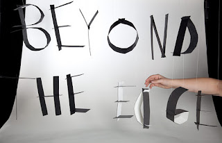
   4. Ramona Todoca - beyond the edge. A 3D typographical sculptural piece. 

5. By 'Bang Bang' identity. http://www.atelierbangbang.ca/

Identify 5 examples of Graphic Design performing different functions:

 
1. Identity
Deskidea is an office supplies e-commerce business with one main aim: to get a major sense of simplicity from the very first purchase from their website until the receipt of the material in your office.
The brand identity was designed to boost this simplicity value and the graphic solution came from the name itself, Deskidea. The idea was to convey its value using basic office objects, with the pencil taking lead role.
The different corporate applications are based on the pencil as a symbol, operating by itself or embedded within the identity.


2. Book. author: unknown
3. Re-branding to prove a point or uncover the truth.
"Brand Wars: Jedi vs. Sith" by Barn Bocock aka HtCRU / HtCRU

4. To promote. The Decemberists London Concert Poster by Mike King 

 5. To entertain. This is an ongoing personal project. Created with Luxology Modo and based on my characters. By Teodoru Badu.

Identify 5 examples of Graphic Design delivering different types of messages:

 1. Educational. Brockhaus Horizonte Encyclopedia Infographics

 2. Informational

 3. Political. Shepard Fairey. Obama campaign. 

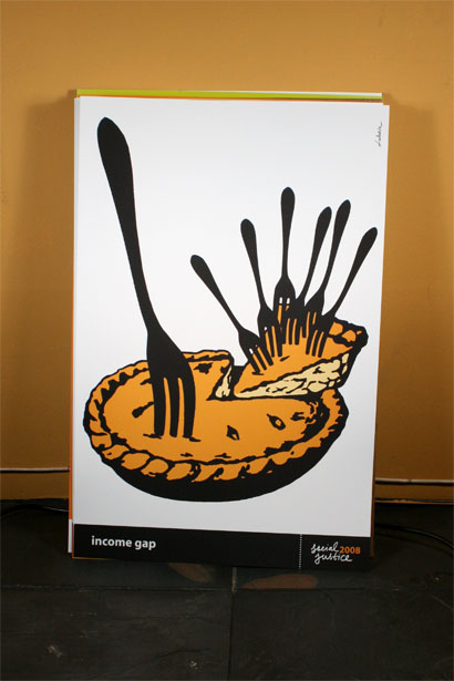
4 Questioning the audience. by Adbusters.

 5. Social problems.

For as long as I can remember, at least ten years back, I have admired the work of Luba Lukova, with its restrained one- and two-color palettes and poignantly simple illustrations. I have always seen the work in books or online, small and only fractionally representative of the impact its bigger brethren have. With Social Justice 2008, a 21.5-inch by 14.5-inch portfolio of twelve, unbound posters by Lukova, published by Clay & Gold Editions, her work is given a second life — both as artifacts that once already existed and by assigning each with a concept, notion or social issue that is intimately tied with our current state of affairs.


Identify 5 examples of Graphic Design produced using different media:

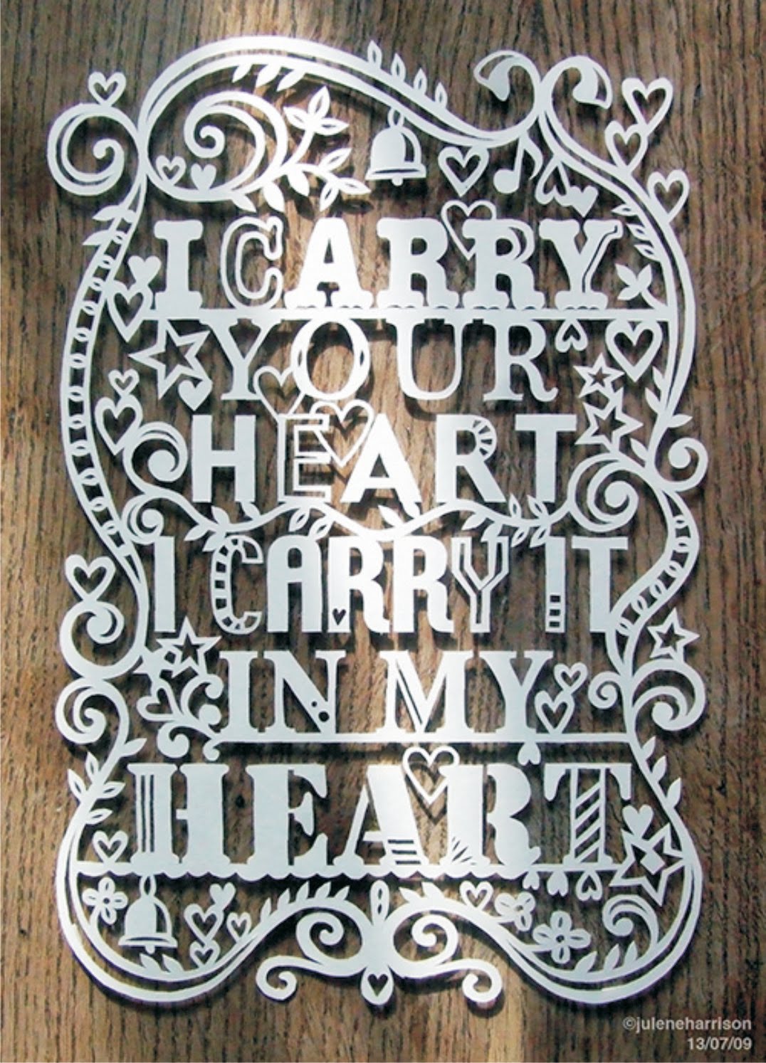
 1. Wood. by Sophie Wilson.

2.Paper

 New book designed by DED. 'VITAL' - A collection of essays, memories and photographs that celebrate international Chinese live artists focusing on the Vital Festivals organised by Chinese Arts Centre. A lovely multi-stocked book to be viewed as a scrap-book on Chinese Live Art.

7 different paper stocks, special inks and a do-it-yourself diecut cover make this a beautiful piece of print.


3.T-shirt

We recently launched a project called "This is What Matters to Me", a cause-inspired collaboration between 9 designers from around the globe, each
supporting a cause/organization personally significant to them.

The aim of the project was to bring focus to a few lesser known causes via limited edition prints. Each shirt is limited to an edition of 150.

Contributors include Non-Format, No Pattern, Mario Hugo, Keetra Dean-Dixon, Emil Kozak, Gary Fernandez, Grandpeople, Marta Cerda Alimbau, and myself.

 4. Wall paper

Be the envy of all your friends with these tall silver birch trees wall stickers, designed to fill a whole wall. They come individually so you can spread them out on a wall or even all around the house! The trees stretch from floor to ceiling and are ideal for spaces such as living rooms, bedrooms and kitchens, hall ways and even outside. The pack contains 6x silver birch trees, each one measuring 240cm high and together are 3.5 m wide and 5x birds measuring roughly 28cm x 20cm.
These Wall stickers are really popular and are a great way to bring a quirky focal point to the room.

All Vinyl Impression wall decals/stickers are precision cut from our high grade low-tac removable self adhesive vinyl in the colour and direction of your choice. Supplied with detailed fitting instructions and pre-applied application tape to ensure transfer is made in no time, correctly and with ease.

[CUSTOM SIZE]
If you need a smaller or larger size then just send us a convo for pricing and we will be happy to list it for you.

[REVERSED IMAGE]
The decals can be reversed/mirrored. Just mention it in the message to seller section of checkout. Read Less
 
5. Web-design, mobile apps 

A redesign of the standard iPhone app icons. In different sizes so you can see more information like messages right from the home screen.
In a retro pixel '8-bit' style 

 Identify 5 examples of Graphic Design produced at different scales:

1. A0 (1682 x 1189 mm) Poster by Peter Tarka

2.
2. Wall paper by Bruce Mau. 

General Electric (GE) is a global infrastructure, finance and media company serving customers in more than 100 countries with nearly 300,000 employees, taking on today’s toughest challenges. From everyday light bulbs to fuel cell technology, to cleaner, more efficient jet engines, GE has continually shaped our world with groundbreaking innovations for over 130 years. GE (NYSE: GE) works on things that matter. The best people and the best technologies taking on the toughest challenges. Finding solutions in energy, health and home, transportation and finance. Building, powering, moving and curing the world. Not just imagining. Doing. GE works.
BMD is collaborating with GE to bring the GE Works brand platform to life in GE’s corporate, research and manufacturing facilities. Focusing on high-impact opportunities, we are developing environmental expressions of the brand that are integrated with the existing architectures and functions of each facility, connecting employees and visitors with the core of the four pillars.

We have created a system that is flexible in scale, budget and content., featuring 3D crops of the famous GE monogram, large-scale wall graphics, sculptural elements, digital displays and pillar messaging.
Starting with the GE’s global corporate headquarters in Fairfield, CT, we have been engaged in designing and implementing at flagship sites across the US and around the world, and continue to work with GE on additional locations.
 
3. business card (49mm x 87mm) by William Branton


4. Album cover (300x250mm)  by Martin Stousland
 Monteé - Rendition of you
  • Oslo based popgroup Monteé released their second album rendition of you in april 2011. The idea was to create a modern version of Miles Davis classic bitches brew, that was more maximalistic than  minimalistic, but with use of forest elements that the band had used on earlier artwork. All the photos was illustrated, and beside the vinyl edition, the cd version has been produced and other merchandises such as t-shirts, totebags, backdrops etc.

    Design: Christian Bielke & Martin Stousland
    Illustration: Ingri HaraldsenDocumentation photo: Henrik Beck Kæmpe
5. A magazine/news-print (750 x 600 mm)

Thursday 6 October 2011

PPP1 (task 3) group research/decisions

5x CATEGORIES OF GRAFIC DESIGN:

  • CD packaging/music advertising 
  • Tourist/Direction signs
  • Branding/Fast food
  • Text books
  • Venues/music
5x FORMS OF EVIDENCE:
  • collecting things 
  • taking pictures
  • browsing the internet
  • visiting places and reflecting things on your blog
  • reading and reflecting
5x CRITERIA OF EVALUATION:
  • organisation
  • variety
  • depth of analyses
  • quantity
  • feedback/reaction to feedback

Thursday 29 September 2011

WHY are WE here (10 reasons that the blog group agreed on)

1. Small year intake
2.To develop a unique style
3.Intense and competitive course - encourages hard work
4.Develop workshop skills
5.Start our career networking
6.To gain better knowledge of graphic design
7.To prepare for professional work
8.It's a studio bassed course
9.Good reputation-hands on tutors
10.Good resources and facilities

Wednesday 28 September 2011

MAX KISMAN (something I came across)

I found his poster in Typography Design: Form and communication by Rob Carter, Ben Day and Philip Meggs. I found it really interesting.
I was doing some research about type. Looking trough the book hoping to find something I could relate to. Though I didn't find what I was looking for, but still this poster attracted  my eye. I was wondering was it the simplicity, the colour or the type that made the poster stand out. I really like that the composition reminds me of a triangle. The front is bold but every letter  relates to a symbol.
 
          Source: http://www.hollandfonts.com/FRE02.html

Max Kisman: In a paper bag, I save all kinds of small objects, which somehow make me think of letters or otherwise intreguing symbols. Cardboard hands for gloves holders, plastic bread bag clips. hinges, can openers, spark plugs, wooden ice cream sticks or ice cream spoons, nails, file separators, fishing weights, and so on.

Shapes, now out of context, which have lost their meaning. They are orphans of an forgotten language.

The WE LOVE YOUR font is an experimental set of characters derived from my 1986 TYP/Typografisch Papier contribution "What every Dutch boy carries in his pockets", an alphabet composed of small found objects. I used this idea in an extended form for my typography workshop “A LETTER CAN BE ANYTHING CAN BE A LETTER”, at the CCA, San Francisco, June 2003
.

Tuesday 27 September 2011

PPP1 (task1) Why Am I Here - What do I want to Learn?

1. Identify and explain 5 reasons why you chose to study on this programme:

  • It's a small course. So we'll be able to know everyone on the course in spite of the the second years and third years. That's why we'll be able to calibrate and create amazing pieces of work together and as individuals. The tutors may also know us better as individuals and they can give us individual critiques and advices.
  • It's a studio based learning environment. It's more professional than in other colleges or universities. We actually will learn how to work in groups and how to use studio spaces and workshops.So we will gain practical skills and theoretical skills together. 
  • It's intense and motivating. We have an intense work pressure but it's only for the better. We'll be able to be professionals in the path we'll choose. It's also competitive. Because we all are trying to work our best. In the end it'll pay off.
  • The course gives me opportunities to develop practical skills on adobe sweet. 
  • The uni gives an opportunity and a strong background to find  work placements. We are being thought to be professionals.

2. Identify and explain 5 things that you want to learn during your time on the programme:


  • An awareness and understanding of what is graphic design. How does it communicate the audience and how to present ideas and solutions to problems in a visual way.
  • A broad range of digital skills and the right ways/places/concepts in use them.
  • I want to learn more about type-faces and to understand how do they work in relation to salving visual problems 
  • How to use workshops (photo studio, screen printing, bonding and so on). I used to be scared of using workshops, because of the things I don't know  and being afraid to ask questions. I think in this course I won't be scared of that at all. 
  • Time managment. Not to be late at deadlines and crits. 

3. Identify and explain 5 skills that you think are your strengths:

  • Photography. I've been interested in photography for a long time now. I think I'm doing something right because people intend to get my ideas and the things I want to say trough pictures.
  • Line drawing. It's more a satisfactory of the drawing 'demon' I have inside. I'm not even sure am I good at it. I just really like it.
  • Combining image and type together. 
  • Researching stuf. I really like going beyond the obvious and looking for serious answers to simple questions.
  • I like experimenting with mixed media. It doesn't matter if it's in a digital or in a more crafty way.


4. Identify and explain 5 things that you want to improve:

  • My photography skills (understand the functions and things You should know in order to produce good quality pictures)
  • Adobe skills (quit obvious why)
  • Time management (I just want to b really good in organising my time in order to be more productive)
  • Communication skills (I have a language barrier, but I intend to to improve my writing, listening and speaking skills to the point where I don't even need to translate stuff (thoughts, sentences, phrases) from my  first language)
  • Learn to creating type-faces (I don't even know how to do that)


5. Identify and explain 5 ways that you will evaluate your progress:

  • The work I'll produce will speak loudly of my improvement. Looking trough the work that I've done earlier and the work that'll be produced in the future. Comparing. Critiquing.
  • Feedback from the tutors and course/group-mates.
  • Reflecting everything I do on my blog or in a notebook/sketchbook. Looking through it and critically  evaluating myself.


6. Identify 5 questions that you want to find the answer to:

  • How can I get a work placement?
  • How to use a professional photo-studio?
  • How to create a website?
  • How to use illustrator? 
  • How to screen-print? 

Friday 16 September 2011

10 Things

10 THING I WANT TO ACHIEVE DURING YEAR ONE :

1. Improve my english skills
2. Work more in Workshops than I did during the Foundation year
3. Understand Graphic Design
4. Find new ways to visually solve problems
5. Get to know everyone on the course
6. Lear and improve new skills
7. Learn to play pool and get good at it
8. Study hard and get everything I can from the college
9. Get the student ID (soon enough)
10. Improve photography skills and use the photo studio at least few times to produce professional photos

10 DEFINITIVE THINGS(GROUP) :

1. Achieve a personal style
2. Experiment with workshop stuff
3. Do one outside brief
4. Improve Adobe skills
5. Be committed to the course
6. Be committed to the blogs
7. Time management
8. Sell a piece of work
9. Work collaboratively & get feedback from group
10. Pass the year - with a decent grade